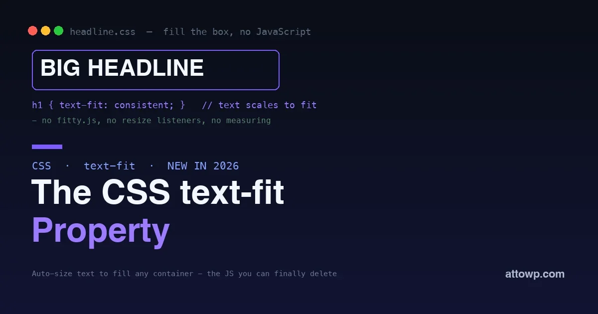
Making text fill its container, a hero headline that stretches edge to edge, a number in a dashboard tile that is as big as it can be, a word on a poster sized to the box, has always been a genuinely hard problem in CSS. Font size is a fixed number; it does not know how wide its container is or how many characters it holds. So for years the answer was JavaScript: a library that measures the text, measures the box, and adjusts the font size until they match, re-running on every resize. Edge 150, released in July 2026, ships a CSS property that does this natively: text-fit. It scales the font size of a text node to fit the width of its container, no measuring, no library, no resize listeners.
This post explains what text-fit does, why it replaces a whole category of JavaScript, how to use it, and how to adopt it safely while browser support is still rolling out. If you have ever shipped a script just to make a headline fill its box, this is the CSS you were waiting for.
The problem text-fit solves
Consider a hero section with a headline that should span the full width of its container, big and bold, filling the space. With normal CSS you pick a font size and hope. Pick it for a long headline and a short one looks tiny; pick it for a short one and a long one overflows or wraps awkwardly. The right size depends on both the container width and the text length, and those change, different headlines, different screens, so no single fixed size is correct. The same problem appears in dashboard tiles showing a number that should be as large as fits, in cards with titles of varying length, and anywhere text should be sized to its box rather than to a guess. CSS could never express “make this text as big as it can be while fitting,” so we reached for script.
What we used to do: JavaScript
The established solution was a small library, the well-known ones measure the text, measure the container, and set a font size that makes them match, then listen for resize events and recompute. It works, and plenty of sites still ship it, but it carries real costs. It is JavaScript loaded and run for a purely presentational job. It runs after the page paints, so you often see the text at the wrong size for a moment before the script corrects it, a flash of mis-sized text. It has to keep re-measuring on resize, which is work on the main thread. And it is a dependency to maintain. All of that to do something that is fundamentally about presentation, which is exactly the kind of job that belongs in CSS.
Before and after: the code you delete
The contrast is stark once you see it. The JavaScript approach means loading a library, initializing it on your elements, and keeping it running:
// The old way: a library, an init, a resize dependencyThe CSS replacement is a single declaration that the browser evaluates at layout time:
import fitText from 'some-fit-library';
const titles = document.querySelectorAll('.hero-title');
titles.forEach((el) => fitText(el));
// ...and it re-measures on every resize, after paint
/* The new way: one property, no script, no flash */Beyond being shorter, the CSS version is better in ways that matter. It runs before the first paint, so there is no moment where the text appears at the wrong size and then jumps, the flash that the JavaScript approach almost always produces. It has no resize listener consuming the main thread. And it is one fewer dependency to load, bundle, and maintain. Deleting the library removes not just code but a whole set of timing and performance concerns that came with doing layout work in script.
.hero-title {
  text-fit: consistent;
}
The CSS text-fit property
The text-fit property scales a text node’s font size so it fits the width of its containing box, in pure CSS. In its simplest form you apply it to the element whose text should fill its container:
.hero-title {The browser sizes the text to fit the box, and because it is CSS, it happens before paint and updates automatically as the container changes, with no script and no flash. The value controls how the fitting behaves, whether the browser aims for a consistent size or fits per line, so you can tune it to the effect you want. The point is that the decision, how big can this text be while fitting, is now made by the browser at layout time, which is both faster and more correct than a script measuring after the fact.
text-fit: consistent;
}
Understanding the values
The behavior of text-fit is controlled by its value, and understanding the options lets you get exactly the effect you want. A consistent fit aims to size the whole text node to one font size that fills the box, which is what you usually want for a single headline or a number, everything at one harmonious size. Per-line fitting instead sizes each line to fill the width independently, which produces the poster-style look where every line stretches edge to edge at a different size, dramatic for display typography and quote cards. Choosing between them is a design decision: consistent for a clean, unified heading, per-line for a bold, filled, editorial effect. Start with the consistent behavior for most interface uses, and reach for per-line when you specifically want that stretched-lines aesthetic. Either way, the browser handles the sizing math that used to live in a library.
Where text-fit shines
Some interfaces are transformed by having this natively. The obvious one is big display typography: hero headlines, section titles, and cover text that should fill their width look intentional and bold without hand-tuning a font size per breakpoint. Data displays are another: a dashboard tile or stat card where a number should be as large as fits, regardless of whether it is 7 or 1,428,905, finally works without script. Cards with variable-length titles get consistent, filled headings instead of a size that suits one title and not the next. And any design where text is meant to be a graphic element sized to its container, posters, quote cards, feature callouts, becomes a CSS concern rather than a JavaScript one. Anywhere you were tempted to reach for a text-fitting library, this is the replacement.
text-fit versus other CSS sizing tools
It is worth being clear about how text-fit differs from the fluid-type techniques you may already use, because they solve related but distinct problems. clamp() with viewport or container units scales font size smoothly between a minimum and maximum based on the viewport or container width, which is excellent for responsive type that grows and shrinks, but it does not account for the length of the text, so a long and a short headline at the same width get the same size. text-fit is different: it sizes the text to actually fill the box given both its length and the container’s width, so the text is as large as it can be while fitting. Use fluid clamp() for body and heading type that should scale with the layout, and reach for text-fit specifically when you want text to fill its container regardless of how long it is. They are complementary tools for different jobs.
Adopting it safely while support rolls out
Here is the honest part: text-fit is brand new, shipping first in Edge 150 in July 2026, with other browsers expected to follow. That means it is not yet everywhere, so you adopt it as a progressive enhancement, not a load-bearing dependency. The pattern is simple and safe: set a sensible default font size that looks fine on its own, then let text-fit improve it where supported. Browsers that do not yet understand the property ignore it and keep your default, so nothing breaks; browsers that do get the filled, auto-sized version.
.hero-title {You can also gate more elaborate enhancement on feature support with an
font-size: clamp(2rem, 8vw, 6rem); /* good default everywhere */
text-fit: consistent; /* enhancement where supported */
}@supports query if you want different layouts for the two cases. But the base pattern, a fluid default plus text-fit on top, means you can start using it today for the browsers that have it, with zero risk to the ones that do not. That is the beauty of a CSS feature that degrades to being ignored: adoption costs you nothing but a sensible fallback you would want anyway.
Caveats and good practice
A powerful sizing tool deserves a few guardrails. Because text-fit can make text large, mind readability and accessibility: text sized to fill a box should still respect the user’s ability to read it, so pair it with sensible limits where the content is not purely decorative, and remember that very large or very small auto-sized text can affect legibility and reflow. Keep it for the cases where filling the container is genuinely the design intent, headlines, display numbers, feature text, rather than applying it to body copy, which should follow normal readable sizing. Test how it behaves with the range of real content you will actually have, a one-word title and a long one, a small number and a huge one, so the filled result looks intentional across the spread, not just for the example you designed with. And keep the fluid fallback in place so the experience is good even before the property is supported everywhere. Used deliberately for display text with a sensible default underneath, it is a clean win; applied indiscriminately, auto-sizing text can fight readability, so aim it where filling the box is the point.
Why this fits the bigger CSS story
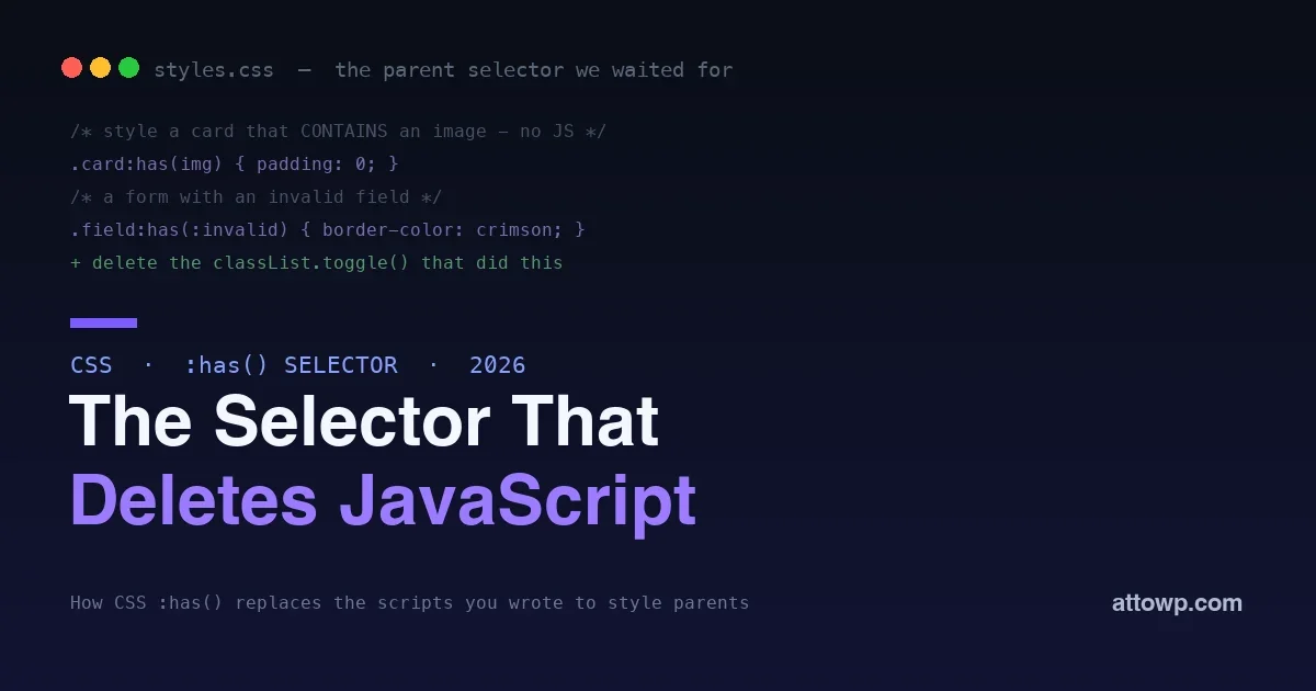
The text-fit property is part of a clear pattern in modern CSS: the platform steadily absorbing the jobs we used to write JavaScript for. Styling open elements moved to CSS, styling a parent by its children moved to CSS with the :has() selector, controlling the cascade moved to CSS with cascade layers, and now sizing text to fit its box moves to CSS too. Each one removes a dependency, a script that ran after paint, and a class of bugs, and each makes the declarative version faster and more correct than the imperative one it replaces. The lesson for developers is a reflex worth building: before reaching for a library to do something visual, check whether CSS now does it natively. More and more often, as with fitting text, it does.
Does text-fit affect accessibility or zoom?
Use it thoughtfully for display text and it is fine, but be mindful that auto-sizing text to a container is a presentational effect, so ensure the content remains readable and that users can still zoom and reflow as expected. Reserve it for headings, numbers, and decorative or feature text rather than body copy, and keep a sensible fallback size, so the experience stays accessible whether or not the property is applied.
Can text-fit size text to a container’s height as well as width?
Its core job is fitting text to the width of its box, which is the common need for headlines and display numbers. Fitting to height as well is a more complex problem that intersects with line breaking and container sizing, so for now think of it primarily as a width-fitting tool, and pair it with your layout so the box has the width you want the text to fill.
Is text-fit a standard, or an Edge-only feature?
It is a web platform feature shipping first in Edge 150, with the expectation that other browsers follow, as is common for new CSS. Because it degrades gracefully, being ignored where unsupported, you can use it now for the browsers that have it while the rest of the ecosystem catches up, rather than waiting for universal support to benefit from it.
Frequently asked questions
Is text-fit ready to use in production?
As a progressive enhancement, yes, today. It ships first in Edge 150 and other browsers are expected to follow, so it is not yet universal, but because unsupporting browsers simply ignore it and keep your default font size, you can apply it now with no downside as long as you set a sensible fallback. Relying on it as the only thing sizing critical text would be premature until support is broad; using it to enhance where available is safe immediately.
How is text-fit different from clamp() and fluid typography?
Fluid typography with clamp() scales font size based on the viewport or container width but ignores the text’s length, so long and short strings at the same width render at the same size. text-fit sizes the text to actually fill the box given its length, making it as large as it can be while fitting. Use fluid clamp() for type that scales with the layout, and text-fit when you specifically want text to fill its container regardless of length.
Will text-fit replace JavaScript text-fitting libraries?
For the common case, yes, once support is broad. The libraries exist only because CSS could not size text to fit, and text-fit removes that reason, doing the job before paint with no script and no flash of mis-sized text. Until support is universal you may keep a library as a fallback for older browsers, but the direction is clear: this is work moving out of JavaScript and into the platform.
Does text-fit work with responsive layouts?
Yes, that is a core strength. Because it responds to the container’s width in CSS, the text re-fits automatically as the layout changes, on resize, on different screens, in different containers, with no listeners to wire up. Combined with a container-aware layout, text sized with text-fit stays filled and proportionate wherever it lands, which is exactly the behavior the old JavaScript approach struggled to keep in sync.
Can I use text-fit in a WordPress block theme?
It is ordinary CSS, so it works anywhere your styles apply, including block themes, editor styles, and additional CSS, in the browsers that support it. It is especially handy for cover blocks, headings, and custom patterns where a title should fill its space, letting a theme deliver filled display type without shipping a JavaScript dependency, with a fluid font-size default covering browsers that do not yet support the property.
Should I remove my text-fitting library now that text-fit exists?
Not immediately, but plan for it. While browser support is still rolling out, a library can serve as the fallback for browsers that lack the property, with text-fit taking over where available. As support broadens, you can drop the library entirely and rely on the CSS, removing the dependency and its resize work for good. Treat the transition as a gradual handover rather than a hard switch, and you get the benefit now without breaking older browsers.
The bottom line
Sizing text to fill its container was one of the last common design tasks that still required JavaScript, and text-fit ends that. Landing first in Edge 150 in July 2026, it scales a text node to fit its box in pure CSS, before paint, with no library, no resize listeners, and no flash of mis-sized text. Use it for hero headlines, dashboard numbers, variable-length titles, and any text meant to fill its space, and adopt it now as a progressive enhancement, a fluid font-size default plus text-fit on top, so the browsers that have it get the filled version and the rest keep a sensible fallback. It is one more job moving from JavaScript into the platform, and like the others, the CSS version is smaller, faster, and more correct. The next time you are about to reach for a text-fitting script, reach for a property instead.



No comments yet