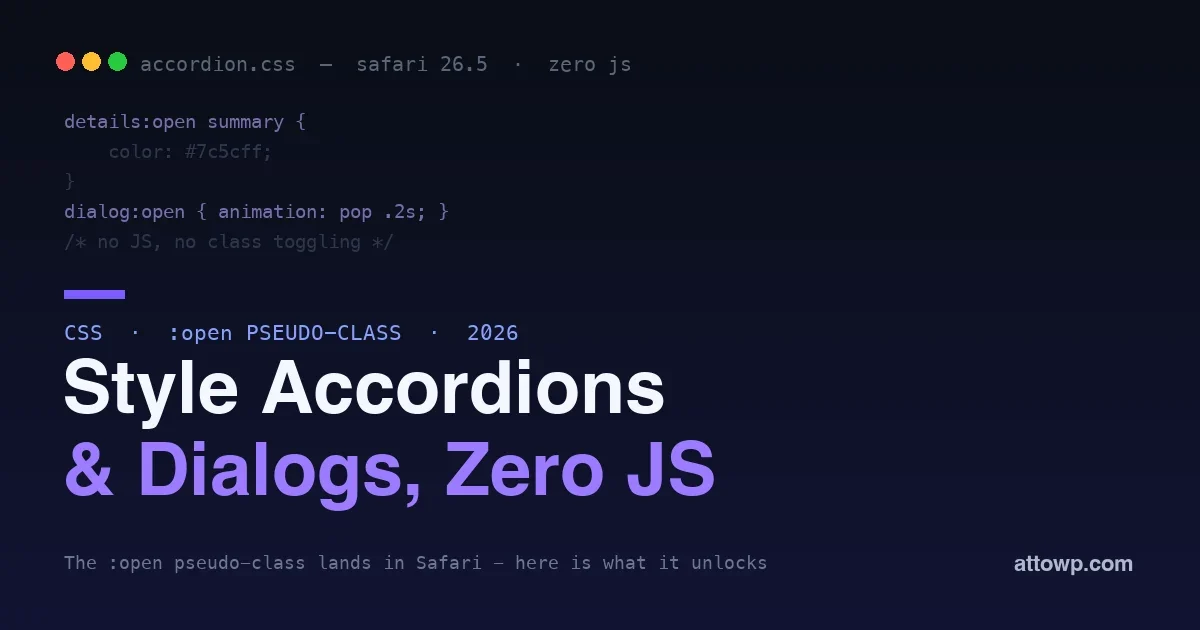
Styling the open state of an accordion, a dialog, or a dropdown has always meant reaching for JavaScript. You toggle a class when the element opens, style that class, and remove it when it closes. It works, but it is boilerplate, it is a place for bugs, and it is JavaScript doing a job that is really about presentation. Safari 26.5, shipped on 11 May 2026, removes the need for it with the CSS :open pseudo-class, a single selector that matches any interactive element while it is open.
This post covers what :open matches, why it beats the old approaches, and real examples for accordions, dialogs, dropdowns, and pickers, all in pure CSS. If you build interactive UI in the block editor or on the front end, this is a small feature that quietly deletes a lot of code.
What :open matches
The :open pseudo-class matches these elements while they are in their open state, using one consistent pattern across all of them:
<details>while it is expanded.<dialog>while it is shown viashowModal()orshow().<select>while its dropdown is expanded.<input>while an associated picker is displayed, such as a date or color picker.
That is the headline: one selector, four element types, the same mental model for all of them. Before :open, styling these states meant different techniques for each, and two of them were not reachable from CSS at all.
Why it beats the old ways
There were two ways to style an open state before, and :open improves on both.
The first was the [open] attribute selector. It works on <details> and <dialog>, because those reflect their state as an attribute, but it does nothing for <select> or <input> pickers, which have no such attribute. So it only ever covered half the cases.
The second was JavaScript: listen for open and close events, toggle a class, style the class. That covers everything, but it means shipping script for a purely visual concern, keeping the class in sync with the real state, and adding a failure point. The :open pseudo-class does the same job declaratively, always in sync with the element’s actual state, with no script at all.
The JavaScript this replaces
To appreciate the win, look at what a scripted accordion used to require. You added an event listener for the toggle event on every <details>, set or removed an is-open class in the handler, and wrote CSS against that class. Multiply that across a page of collapsible sections, a modal, and a custom dropdown, and you have a small pile of state-syncing code whose only job is to mirror something the browser already tracks internally.
Every line of that is a chance for the class to drift out of sync with reality: an edge case where the element closes but the handler does not fire, a race during hydration, a component that forgets to clean up its listener. The :open pseudo-class removes the entire category of bug by reading the real state directly. There is nothing to sync because there is no duplicate state. That is the deeper value beyond writing less code: the code you delete was the code most likely to be subtly wrong.
Example: a pure-CSS accordion
The classic use is a <details> accordion. With :open you can style the open item and animate its marker without a line of JavaScript:
details:open summary {The open item’s summary changes color and its chevron rotates, purely from the element’s own state. Open and close it as many times as you like; the CSS always matches because it is reading the real state, not a class you have to maintain.
color: #7c5cff;
font-weight: 600;
}
details:open summary .chevron {
transform: rotate(90deg);
}
summary .chevron {
transition: transform 0.2s ease;
}
Example: styling an open dialog
A <dialog> opened with showModal() can be styled and animated on its open state directly:
dialog:open {The dialog animates in whenever it opens, with no JavaScript hook beyond the native
animation: dialog-pop 0.2s ease-out;
}
@keyframes dialog-pop {
from { opacity: 0; transform: scale(0.96); }
to { opacity: 1; transform: scale(1); }
}showModal() call that opens it. The presentation stays entirely in CSS where it belongs.
Example: dropdowns and pickers
This is where :open does something genuinely new, because the old attribute selector could not touch these. You can now react in CSS to a native <select> being open, or to a date or color picker being shown:
select:open {The select highlights while its options are showing, and the date input changes background while its picker is open, feedback that previously was simply not available to CSS.
border-color: #7c5cff;
box-shadow: 0 0 0 3px rgba(124, 92, 255, 0.2);
}
input[type="date"]:open {
background: #f5f3ff;
}
A practical pattern: a no-JS disclosure menu
Put the pieces together and you can build a disclosure menu, the kind of expandable navigation that usually needs a script, entirely from native elements and :open:
nav details .menu { display: none; }The menu expands when the
nav details:open .menu { display: block; }
nav details:open summary {
background: #1e1b2e;
color: #fff;
}<details> is opened by click or keyboard, styles itself while open, and needs no event listeners. It is accessible because it is built on a native disclosure element, and it is themeable because :open gives CSS the hook it always lacked.
Going further: :open with combinators
Because :open is a normal pseudo-class, it composes with the rest of CSS. You can style descendants of an open element, react to an open element’s siblings, or scope the styling to a container. A common pattern is changing a summary label or revealing a hint when a panel expands:
details:open > summary::after {The same combinator rules you already know apply, which means
content: "Close";
}
details:open ~ .hint {
opacity: 1;
}:open slots into existing CSS without new concepts. It is one more state selector alongside :hover, :focus, and :checked, and it behaves exactly as you would expect from those.
Progressive enhancement, by default
The best part is that :open is safe to use today, before every browser supports it. A browser that does not understand the selector simply ignores the rule, and the underlying element still works exactly as it always did. Your accordion still expands, your dialog still opens, your select still drops down; they just miss the extra styling in older browsers. That means you can add :open polish now as a genuine enhancement, with no fallback code and no risk to the core experience.
The accessibility payoff
There is a quieter win here. Because :open works on native elements, <details>, <dialog>, <select>, it rewards using the built-in, accessible controls instead of rebuilding them from <div>s. A native <details> accordion is keyboard operable and announced correctly by screen readers out of the box; a native <dialog> handles focus trapping and escape. Styling their open state in CSS means you get the accessibility for free and the design without JavaScript, instead of trading one for the other. The feature nudges you toward the platform, which is where accessibility already lives.
What :open does not do
It is worth being clear on the boundaries. :open styles the open state; it does not open or close anything, which is still the job of the element’s native behavior or a user interaction. It does not animate the collapsing of a <details> element on its own, since transitioning to auto height remains a separate CSS challenge. And it does not turn a <div> into an accordion; it only reflects the state of elements that genuinely have an open and closed mode. Think of it as a read-only view of an element’s openness that you can style against, not a control for changing it.
Where this fits in the bigger shift
The :open pseudo-class is one small entry in a long trend: the web platform steadily absorbing jobs we once reached for JavaScript to do. Native dialogs replaced modal libraries, container queries replaced layout scripts, and scroll-driven animations replaced a class of scroll listeners. Each removes a dependency, a bundle of state to keep in sync, and a set of bugs. Styling the open state is a modest example, but the pattern is worth internalizing: before writing a script for a behavior, check whether the platform now does it declaratively. More and more often it does, and the declarative version is smaller, faster, and harder to break.
Frequently asked questions
Is :open the same as the [open] attribute?
Not quite. The [open] attribute selector only works on <details> and <dialog>, which expose their state as an attribute. The :open pseudo-class covers those plus <select> and <input> pickers, which have no such attribute, so it is a strict superset with one consistent syntax.
Can I use it in production now?
Yes, as a progressive enhancement. Browsers that support it get the styling; those that do not ignore the rule and the elements keep working. Because there is no fallback to maintain and nothing breaks without it, it is safe to add today for the browsers that have it.
Does it work inside the WordPress block editor?
It is regular CSS, so it works anywhere your styles apply, including block themes and editor styles, as long as the browser supports it. Native <details> blocks and dialogs in your theme can be styled with it directly.
Do I still need JavaScript for accordions and dialogs?
For the styling, no. You still use the native behavior, a <details> element or a <dialog> opened with showModal(), but the visual response to opening and closing moves entirely to CSS. You only reach for JavaScript now if you need custom logic beyond opening and closing.
When will other browsers support it?
The open-state pseudo-class is on a standards track and other engines are moving toward it, but check current support before relying on it as more than an enhancement. The progressive-enhancement approach means you do not have to wait for full support to start using it safely.
Does :open work on the popover attribute?
Popovers expose their shown state, and the platform is converging on consistent open-state styling for them alongside dialogs. Check current browser support for your exact case, but the direction is a single open-state model across these interactive elements rather than a different trick for each.
Can I animate a details element opening with :open?
You can animate properties on the open state, like the summary color or an inner element, immediately. Animating the panel’s height from zero to auto is a related but separate problem that modern CSS is addressing through other features; :open handles the state styling, not the height transition by itself.
Is there a :closed pseudo-class too?
The natural counterpart is simply not matching :open, which you target with your default rules or with :not(:open). That covers the closed state without a separate selector, since an element is either open or it is not.
How does :open differ from :checked for toggle UIs?
They model different things. :checked reflects a form control’s checked state, often used with the checkbox hack to fake toggles; :open reflects the genuine open state of real interactive elements. With :open you no longer need the checkbox hack for accordions, because native <details> plus :open does the job properly and accessibly.
Should I refactor existing JS accordions to use :open?
Where the JavaScript existed only to toggle a class for styling, yes, replacing it with native <details> and :open is a clear simplification. Where the script does real work beyond styling, keep the logic and just move the presentation to :open. Refactor opportunistically rather than all at once.
Does using :open help site performance?
Modestly but genuinely. Replacing state-toggling scripts with a CSS selector removes JavaScript from the page, which means less to parse, execute, and keep in sync. It will not transform your metrics, but every script you delete is weight the browser no longer carries, and native elements styled in CSS are about as light as interactive UI gets.
The bottom line
The :open pseudo-class is a small feature with an outsized cleanup effect. It replaces class-toggling JavaScript and the half-covering [open] attribute with a single declarative selector that styles the open state of accordions, dialogs, dropdowns, and pickers alike. Use it as a progressive enhancement today, lean on native elements to get accessibility for free, and delete the scripts that only ever existed to keep a class in sync with a state the browser already knew. The platform keeps absorbing the jobs we used to write JavaScript for, and this is one more worth handing back. For more on building interactive UI the modern way, see our guide to React in the WordPress editor and how the platform is evolving toward React 19.

No comments yet